Obsidian Graph View: How to Make It Actually Useful
Open the graph view on a vault with four hundred notes and you get a hairball. It is genuinely beautiful, it makes for a great screenshot, and it tells you almost nothing you did not already know.
That is not a defect in Obsidian. The graph is doing exactly what it was built to do, which is draw every note and every link. The problem is that most people open it expecting an answer and it only ever offers a shape.
Here is how to get real work out of it, and what it still will not do.
The short version
- The global graph is a diagnostic, not a daily view. Open it to find orphans and hubs, then close it.
- The local graph at depth one or two is the one worth keeping open while you write.
- Filters are the whole game.
path:,tag:and-file:turn a hairball into an answer. - Groups let you color by meaning, which is the only way a large graph stays readable.
- Obsidian's graph only knows notes. Your clips and snippets are outside it.
Stop opening the global graph and open the local one
The global graph draws your whole vault. The local graph draws one note and its neighbors, and it is the one that earns its place on screen.
Open a note, then open the local graph pane beside it and set depth to one. You now see exactly what this note touches. Push it to two and you see what those notes touch, which is usually where the surprise lives: the note you wrote in March that quietly connects two projects you thought were separate.
Depth three is where it becomes a hairball again. There is no vault size where depth three is readable.
Filter it, because an unfiltered graph is a screensaver
The graph accepts the same search syntax as the sidebar, and this is the single biggest upgrade available to it.
path:Projects draws only your projects folder. tag:#reading draws only what you tagged. -path:Daily removes your daily notes, which in most vaults are half the dots and almost none of the meaning. Combine them and you get a graph of one question rather than a graph of everything.
Most people never type anything into that box. It is the difference between a picture of your vault and a picture of your problem.
Use groups to color by what you care about
Groups take a search query and paint every matching node a color you pick. tag:#active in orange, path:Archive in gray, everything else default.
Now the graph is legible at a glance, because color is doing the work your eyes are good at and position is doing the work they are bad at. Three or four groups is the useful range. Past that you are back to reading a paint chart.
Give it one job: find the notes nothing links to
The most valuable thing the global graph does is show you orphans, the dots floating at the edge with no lines at all.
Those are notes you wrote and never connected to anything, which usually means you will never find them again. Filter to -path:Daily, look at the edges, and link or delete what you find there. Ten minutes of that is worth more than a month of admiring the middle.
The limit no setting fixes
Everything above makes the graph better at showing you structure. None of it widens what is on the canvas.
Obsidian's graph draws notes. It does not draw the screenshot you copied last Tuesday, or the paragraph you saved as a snippet and have reused forty times since. A surprising amount of what you go looking for was never a note in the first place, so it is simply not in the picture.
That is the gap, and no filter closes it.
What changes when the graph spans more than notes
TypeFire 5.0 draws a graph over the same markdown vault Obsidian reads, in place, with no import and no conversion. Two things are different about it.
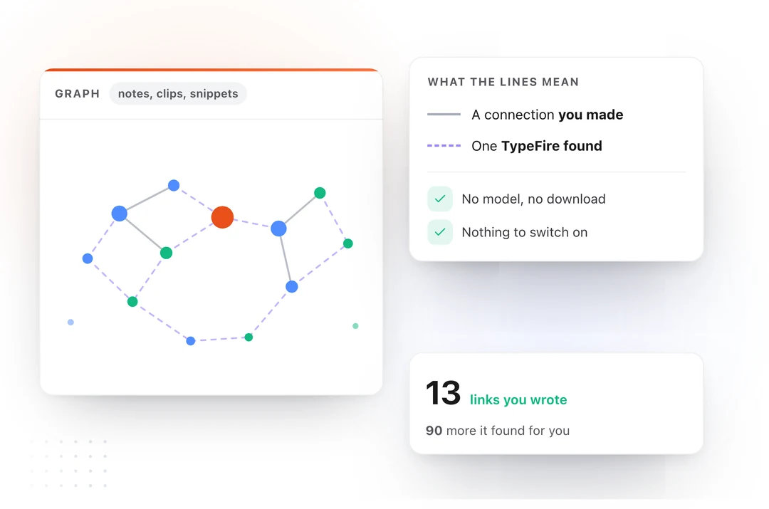
The first is what is on the canvas. It is not only notes. Your clipboard history and your snippet library are there too, so the screenshot you pasted into Slack in August sits next to the note where you wrote the decision down. Most of what you want back was never a note.
The second is that connections are not limited to links you typed. Turn on Weave, the local index, and TypeFire adds connections it worked out from meaning. Those are drawn dashed, and links you wrote stay solid, so a guess can never pass itself off as your own reasoning. That distinction is the reason the picture is readable at a glance rather than something you have to verify line by line.
The graph itself needs none of that. Links, tags and folders are already in your files, so it draws with no model, no download and nothing to switch on. Weave is off until you ask for it, and when you do it tells you the size of the one file it needs first.
Most people run both apps: Obsidian to write in, TypeFire to search, capture and see the shape from every other app on the Mac.
All of it is free, including for people who already bought Pro.
So what should you actually do
Keep Obsidian's graph for what it is good at. Open the local graph at depth one while you write, filter the global graph when you go orphan hunting, and stop expecting it to answer anything.
Then, if what you actually wanted was to see your clips and snippets in the same picture, use something that draws all three.
Download TypeFire for Mac, or read more about running TypeFire and Obsidian together.
Loved by people who type all day.
Unprompted reactions from users, in their own words.
Used by people at
Company names are places where our users work. They do not imply endorsement or affiliation.